Review: Aplus GV18 smart watch

Like many tech enthusiasts Dummy and I have been keeping an eye on the smart watch market for a while. As you will probably know, there a few large companies (with the Chinese snapping at their heels) searching for the holy grail of wearables: a beautiful wristpiece that is elegant, convenient, clever and durable. To achieve widespread adoption, it also needs to be affordable. Ah yes, there’s the rub.

I recently stumbled across a smart watch, sometimes called “Aplus”, sometimes “GV18”. It’s fresh out of China. And it bears more than a passing resemblance to the Apple Watch. And it’s a tenth the price. We bought it for £32.98, but we’ve since seen it for under thirty quid. Worth a look then.

First impressions:

Aplus GV18 smart watch 02

  • The watch doesn’t look quite as nice as the computer-generated photos on websites, but it’s still reasonably attractive, as smart watches go.
  • It’s big (13mm deep) and stands quite proud of the wrist.
  • The case has a captive screw on the back, which stands out by about 1.5mm. Not a huge problem, but it seems like a strange design choice because the screw is for looks only. The case pops off easily (too easily) and the hole the screw sits in is considerably larger than the diameter of the screw. So it turns freely.
  • The manual is poorly translated.
  • The watch comes with a screen protector pre-installed, which suggests the glass underneath will not be scratch-resistant.
  • The rubber strap is very comfortable.
  • Horribly irritating (loud) jingle when you first switch it on.

Timepiece

For me, the problem with most smart watches is the watch part. Sounds obvious doesn’t it. Really, what is the point of a watch that isn’t a very good watch? If I turn my wrist to check the time, but before I can see the time I have to press a button, that’s a retrograde step. That’s worse than analogue. And so it is with this watch. It’s an LCD display, not e-ink, and to keep the display lit permanently would be a huge battery drain. So you have to press the side button, to check the time.

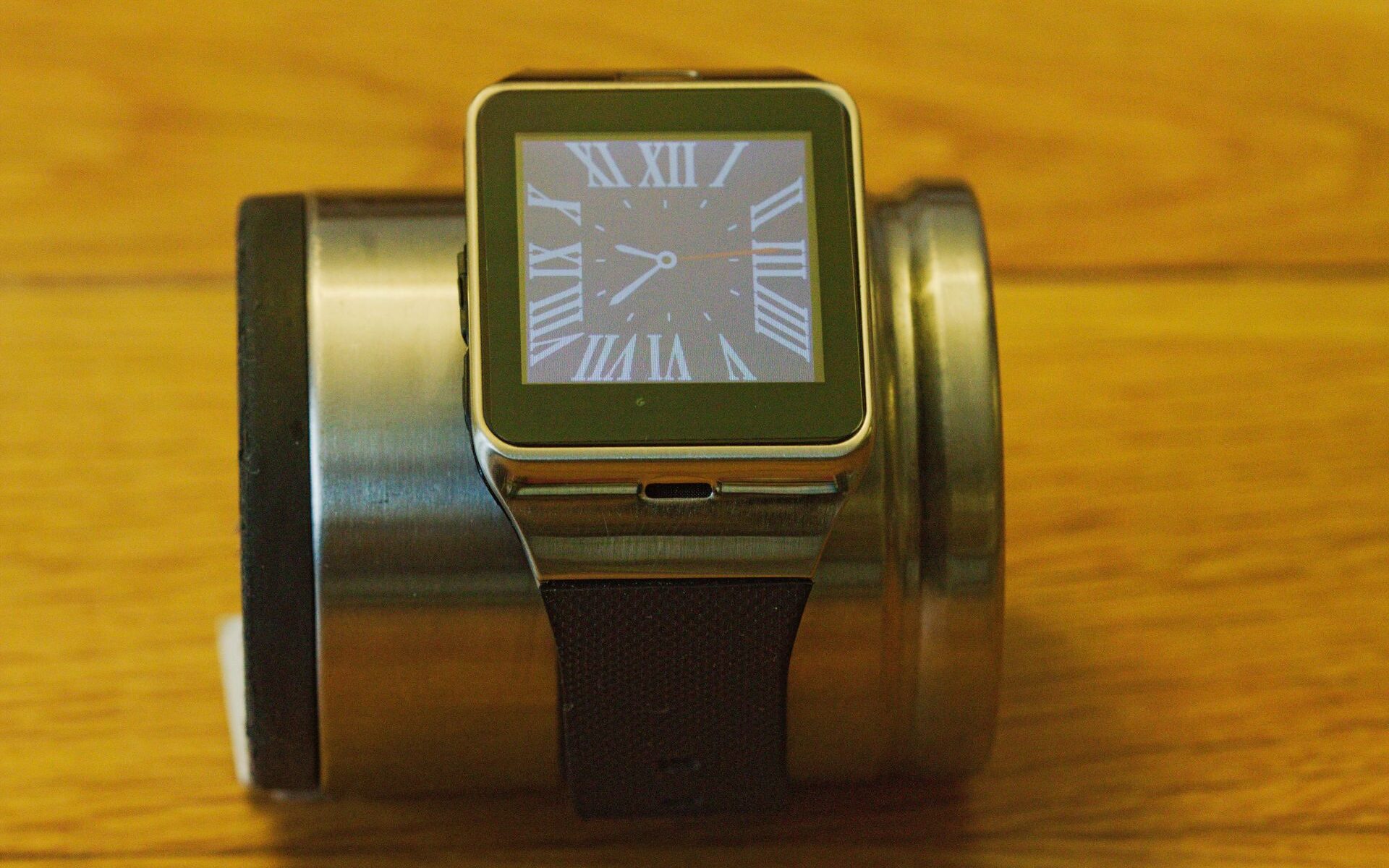
Once you’ve done that, it’s not too bad. There’s a choice of three watch faces. One of these faces has a full dial of Roman numerals and is designed sympathetically with the rectangular case. I think it works. Of the other two, one is clumsy and the other is weird.

This slideshow requires JavaScript.

Interface

Oh dear it’s awful. To be honest, I think they probably all are, from all manufacturers. Anything that can’t be done with a press or a flick is a pain in the neck. Unless your fingers are like matchsticks, it’s hard to type letters with a high degree of accuracy on the software keyboard. It’s a little better with numbers, but still vaguely reminiscent of those calculator watches from the eighties. Is this really all the progress we’ve made in 30 years?

This slideshow requires JavaScript.

Apps

As far as I can tell, this is running a bespoke version of Android. There’s no app store, no access to Google Play. There are some bundled apps, but most of them are useless and half of them only work if you have inserted a SIM card. That alone is odd. The watch is designed to be paired with a smart phone. Why would you give it its own SIM card?

I wish I could tell you more about the apps, but most of them made no sense. The only real exceptions were the calculator and the camera. But both of those were such a fiddle to use, you’d be much more likely to reach for your phone. It has a pedometer, but it just doesn’t work.

Sync software

For the watch to talk to the phone, you have to install an app. The app is not the best. There are few settings. You can choose to ignore notifications from certain apps, but it’s a slow and laborious process choosing which apps you do and don’t want to hear from.

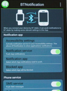
BT Notification

(Sorry about the poor screen grab by the way.)

If Bluetooth is switched off when you launch the notification app, you are greeted with the following informative message. Informative that is, if you can read Chinese.

Aplus Bluetooth notification

I deduced this meant you need Bluetooth to be switched on… With Bluetooth switched on, the app needs to be running in order for the watch to receive notifications. The app seems to die all on its own, without warning, and the only way you’ll know that is if notifications stop arriving on the watch.

Specifications

Headline specs when compared to the similar size 42mm Apple Watch

Spec Aplus GV18 Apple Watch 42mm
Screen 1.54″ capacitive 1.54″ capacitive
Battery 450mAh replaceable (though the battery in our unit was labelled 550mAh) 246mAh non-replaceable
Claimed battery life (talk time) 72 hours 3 hours
Thickness 12.3mm 12.6mm
Bluetooth 3.0 4.0 Low Energy
Processor 533MHz MTK6260A Apple S1
Storage 128M 8GB
MicroSD/TF slot Yes, 32GB max No
Pixels 240×240 390×312
Sensors accelerometer accelerometer, heart rate
GPS No Yes
Phone GSM/GPRS 850/900/1800/1900 (SIM slot) Yes
Charging Cable Inductive
Weight 50g 51g
Camera Yes, 1.3MP No
NFC Yes, built into strap Yes
USB port Micro USB No

Flaws

There are many.

  1. Convenience. Above all else, a watch should be two things: convenient and attractive. This is not convenient. If I glance at my wrist to see the time, I’m met with a blank screen. No “shake to wake”. You have to fumble for the button, which if like me you wear your watch on your left wrist, is quite awkward to reach.
  2. Volume control. There is no obvious volume control for notifications.
  3. Bluetooth music. You can stream music to your watch via Bluetooth. And listen to it on your watch’s tiny speaker. Which is probably inferior to the speaker in your phone. Which you’re streaming from (and which has to be within 10 metres, due to the limitations of Bluetooth). There’s no headphone socket. So what’s the point?
  4. Time synchronisation. When the watch first connects to the phone, it asks if you want to sync the time. Since I live in the UK, my phone is set to GMT with daylight saving time. On syncing with the phone, even though the watch is set to the same time zone it changes itself to Amsterdam and puts the clock out by an hour.
  5. Notifications. The pop up notifications are almost useless. They tell you for example that you’ve received an email, but there’s no way on the watch of seeing that email or even any context from the email. So you have to check your phone. So you may as well just check your phone, right?
  6. Notifications again. There’s an option to switch off the notification tone. It doesn’t work. So, like it or not, if you have pop up notifications, you’re also going to have an annoying beep. And there’s no way of changing that beep. Which brings me to my next point.
  7. Customisation. You can’t customise this watch – which is a huge loss. There are three watch faces (and two of them don’t suck too badly), but that’s all. You cannot add more. There are three themes for the menu/app system. Two of them are horrendous. The third is tolerable. You cannot add more. Oh, and apps? That deserves a bullet point of its own.
  8. Apps. As I mentioned before, other than the few bundled with the watch, there aren’t any. There’s no equivalent of the iTunes or Google Play app stores. So you’re stuck with these apps.
  9. Interface. You need fairly slender fingers to operate it – especially the software keyboard. Very hard to hit the right letter. And since there’s no voice control (see next bullet point), you’re stuck with touch/swipes.
  10. Voice control. There isn’t any. And this is, we think, going to be crucial in this technology market. Watch faces will always be smaller than phone screens. It’s essential that you have a usable and convenient way of controlling them. That means you need either an external interface (keyboard? your phone?), which sort of defeats the point, or voice activation. Or maybe, fast forward 20 years, a neural interface. This watch has neither, by the way.
  11. Style. In our opinion, the Moto 360 and the LG Watch Urbane are possibly the only smart watches right now that aren’t ugly. People will accept a certain level of aesthetic compromise in exchange for features (e.g. the massive “brick” phones of yesteryear), but not much. And with the 360 and Urbane on the market, all other smart watch manufacturers need to think long and hard about style.
  12. Reliability. Bluetooth keeps disconnecting and reconnecting – even when the phone and watch remain next to each other. Is this the phone’s fault? The watch’s? Who knows. But every time they reconnect, the watch prompts you whether or not you want to sync time (you don’t, see above!) and then spits out all the notifications currently unviewed on the phone. Which are then a bit of a pain to acknowledge/delete.
  13. Visibility. It’s really difficult to read the screen when outdoors. And when in strong sunlight, there’s no chance. There’s no brightness control, so there’s nothing you can do about this, other than shade the screen with your hand. And squint.
  14. Build quality. The back is not secured well (because the case screw does nothing, see above). It doesn’t seem to fit well on the back of the watch. It wouldn’t drop off while wearing the watch, but may at other times.

Strengths

  1. Style. Although it’s no Moto 360, it’s not as bad as some other watches available now. The brushed steel is nice.
  2. Comfort. The rubber strap is surprisingly comfortable. It’s a little on the heavy/chunky side, but you get used to it.
  3. Battery life. It lasted five days before needing a charge. How much this was to do with the fact it was essentially useless, I’m not sure (!) but it still knocks the spots off the Apple Watch in this particular department.

Conclusion

We have to give this watch some credit. For the price, it’s actually pretty incredible. It’s far less ugly than some of the competition and it does have a lot of functionality, even if it’s not especially well executed. We couldn’t help but think that in a world without smart phones, it would even be considered quite good. You could in theory load it up with a SIM card and use it as a watch, phone, calculator, contacts organiser and so on, without needing any other device. But this is a world with smart phones and when you compare it to any smart phone currently on the market, even the worst ones, this watch doesn’t compete at all well. And neither does it complement a phone, bringing no particular tricks to the party.

This slideshow requires JavaScript.

It was a bit of a conversation starter, while I wore it. A novelty. And if you don’t mind paying a little for a novelty item that you’ll quickly find tiresome, then by all means go ahead. But we couldn’t recommend it. We can’t even recommend the Apple Watch, and if Apple can’t get it right, who can?

[easyreview title=”Geek rating” icon=”geek” cat1title=”Ease of use” cat1detail=”Fiddly, fussy, idiosyncratic.” cat1rating=”1″ cat2title=”Features” cat2detail=”Lacking many essentials for a usable smart watch.” cat2rating=”1″ cat3title=”Value for money” cat3detail=”Very cheap, giving the (few) things it can do, but still not remotely worth buying.” cat3rating=”1.5″ cat4title=”Build Quality” cat4detail=”Mixed. Some good bits, some bad bits.” cat4rating=”2″ summary=”Don’t buy it, we beg you.”]

Review: 3-in-1 smartphone camera lens kit for Android, iPhone, iPad, etc.

3-in-1 mobile lens kit 07I own a Canon EOS 60D, which I bought second hand a couple of years ago. It’s a cracking camera and it was an absolute steal on the second hand market. But it’s not very portable. Not when you take into account the other things I stuff into my camera bag: my three main lenses, the filters, the remote shutter release, the lens hoods and so on.

Of course these days, many people carry a half-decent camera with them at all times, in their phones. These cameras aren’t very versatile, but they’re convenient because they’re almost always at hand. And because of this, there’s a healthy phone camera mod market. One of the leaders in this field is the Olloclip.

Olloclips are great. The trouble is, each Olloclip is designed for a particular phone (or small family of phones). So it’s not really transferable. And with prices in the order of £60, you can buy a pretty competent compact point-and-shoot for not much more than that. It’s clever, good quality, but not exactly a bargain. Not like today’s review kit at least.

3-in-1 mobile lens kit 01This 3-in-1 camera kit, like many other Chinese gadgets can be found for sale on a few shopping sites, under various different “brand names”. Our example was sold as a “Yarrashop”, but we suspect that’s just the current trade name of this particular seller. The kit arrived in an anonymous box, with no manufacturer claiming responsibility. And we think that’s a shame, because as we reckon you’ll agree, it’s rather extraordinary.

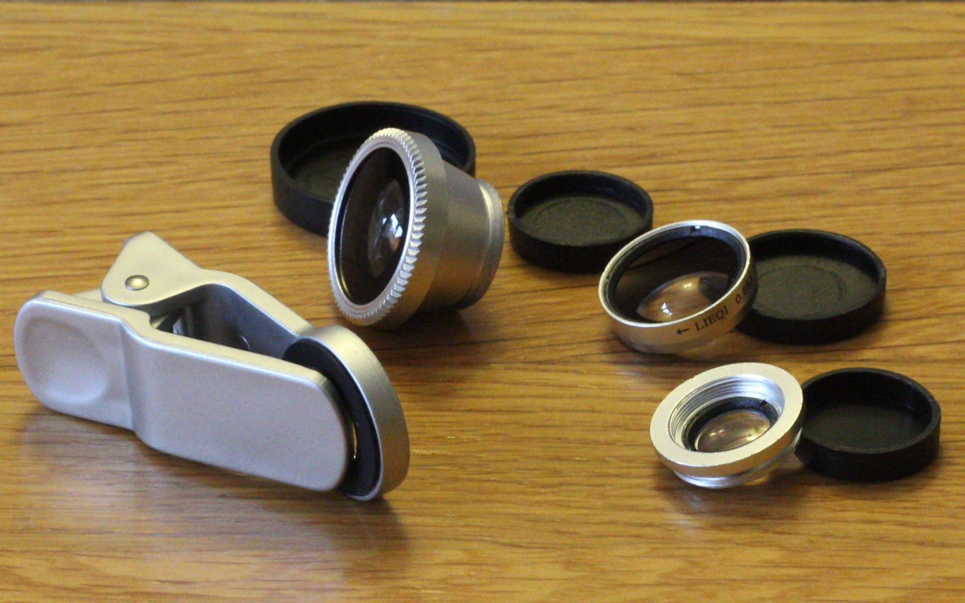
In the box, there are three lenses, a bag and a clip. The bag doubles as a lens cleaning cloth. The clip, with rubber pads, enables you to attach the lenses to virtually any mobile phone or tablet.

One of the lenses is a fisheye lens. The other two can be used in combination, to form a wide angle lens, or you can use the smaller component on its own as a macro lens. The lenses and the clip are all sturdy metal, with a solid feel. They can be purchased in different colours, but we went for silver, which we think suits this kind of equipment.

This slideshow requires JavaScript.

The clip attaches securely on the phone or tablet. You do have to position it carefully – this is hardest with the fisheye lens; with the other two, you can see the phone’s camera lens underneath – but once it’s situated, taking photographs is no harder than usual.

This slideshow requires JavaScript.

With the fisheye lens, the photograph appears as though within a circle cut out from black card, so the photo would need cropping afterwards. The wide angle lens – I’m not sure there’s that much use for it; there’s some barrel distortion at the edges and in any event, most smart phones can stitch shots together into a panorama, which would be far superior. The macro lens, well that’s a cracker. You have to be be very close to the subject, so you’d be unlikely to be able to use this on nervous insects. And you probably don’t have a tripod for your phone, so you need a reasonably steady hand. But in spite of all that, the effect of the lens is impressive.

Here are some example shots, taken with the lens attached to a Samsung Galaxy S5. Click through for the full resolution images.

This slideshow requires JavaScript.

As long as you don’t compare this with DSLR quality, this is not bad at all, right? But then we get to the punchline. These lenses, clip included, will set you back less than £7. That’s unbelievable Seven quid. No matter who I’ve shown this to, when I’ve told them the price they have been incredulous. I still can’t believe it, to be honest. But the truth is shown in my Amazon orders history and on my bank statement.

Under close inspection, there is some loss of clarity and marginally less light hitting the sensor. But if you’re starting out with a very good phone camera, this slight degradation is we think more than acceptable, especially given the increased versatility. A few shots more:

This slideshow requires JavaScript.

You’d think there has to be a catch, wouldn’t you. It’s hard to find one actually. Separating the wide angle lens from the macro lens is s bit fiddly – and counter-intuitive too because it’s reverse-threaded. But not too difficult. And it would be nice to have a case for the lenses – the bag doesn’t do much to protect them. But given the price, we’re really splitting hairs. I dug out an old cufflink case and that was perfect for the job.

I’d say to anyone who takes the slightest interest in phone-based photography – get this kit. You won’t regret it. It’s an absolute bargain, well made and practical. As this price, what do you have to lose?

[easyreview title=”Geek rating” icon=”geek” cat1title=”Ease of use” cat1detail=”Very slightly fiddly. But otherwise extremely simple.” cat1rating=”4.5″ cat2title=”Features” cat2detail=”The kit lacks only a case.” cat2rating=”4.5″ cat3title=”Value for money” cat3detail=”Phenomenal value for money at this price.” cat3rating=”5″ cat4title=”Build Quality” cat4detail=”Well made. I wouldn’t be surprised if the odd unit has burrs on the thread or seams, but I saw no evidence of that here. Not the best optics, unsurprisingly.” cat4rating=”3.5″ summary=”All in all, an outstanding kit. Great as a gift, stocking filler, whatever. Or treat yourself, without really any feeling of guilt. You’d spend more on a couple of pints of beer and you know what happens to that. ;-)”]

Review: Visionaire Vehicle Tracker and Monitoring

Having put hours and hours of work, not to mention thousands of pounds, into my Land Rover Defender, I was dismayed and concerned to learn it is now the most stolen car in the UK!

It seems the very design and nature of a Defender, the thing that makes it so attractive to the enthusiast, is the exact same quality that now attracts some very well organised thieves. It’s like a great big Meccano set. It holds it’s value like no other vehicle and is soon going end of life. All that seems to have exacerbated the problem to a level where if you don’t take measures to protect your Land Rover, you might as well leave it in the street with the engine running.

If someone is coming to get your Defender it’s almost certain they will have visited once before and will have a good idea of what security you have fitted. They may even tamper with it in advance, to make subsequent theft easier. It’s simple to search the various UK forums for advice and security gear and magic ‘theft proof’ devices are numerous and varied with devotees claiming theirs is the one to have.

Here’s a little secret though: none of these precautions work. None of them make your car theft-proof. At best they delay the thief a few minutes; at worst they give you a level of confidence wholly unjustified by the device. With bolt cutters or an angle grinder or if your Defender is very posh, a low loader, none of the devices are going to help you for long. The simple and sad fact is, if they want it, they are having it. So where does that leave you?

I think the concept of a vehicle tracker is relatively old news. I’d guess that you would think them the domain of your supercar owners with expensive installation and yearly costs. As technology and communications have progressed however, that’s no longer the case.

It’s surprisingly simple and pretty damn cost effective and is largely based around mobile phone technology. I know there are many on the market but let me show you one that seems to tick all the boxes.

Land Rover TrackerI’ve installed the £299  Visionaire system from Carrotech – a tiny GPS device with a mobile sim. What first attracted me was the low cost of purchase and very low cost of ongoing use, especially when compared to the popular skytag. But it was only when I started to play with the very user-friendly Internet interface that I realised the true power and convenience of this system.

Tracker rulesOnce installed (buried very deeply somewhere in your Defender’s soul, with its own backup power) the device monitors and records details of every journey you make. Using simple drop down menu options you can then ask the device to advise you either by email or text if anything specific happens. The list is long but things like the battery being disconnected, the car leaving your home address or even predetermined speeds being exceeded can all be recorded and trigger an action. Email and GPS is the first avenue for this messaging but if that fails for any reason then the system will text you details. All this for just £72 a year! Yep just £72. Rather pleasantly I found that when I told my Insurance Company I had this tracker  installed my premium went down by £25 so in theory to have my Defender monitored 24 hours a day, 365 days a year whether I’m in the country or not, it’s costing me £47.

Tracker map for Land Rovers

For me the purpose is to recover my car if it were ever stolen but I can immediately see how you might want to install this in the car if you have kids who have just learnt to drive and want to ‘borrow daddy’s car’ for the evening! If that isn’t enough to have you ordering this brilliant little device already, wait until you see what else it does. It actively monitors where the car has been and overlays that on a combination of OS and/or satellite maps. The tracker software records it all and although I’m not sure how long the data is retained, I was able to check a route from a year ago quite easily – and see my average speed, how fast I drove at what time etc., etc. Okay, maybe that’s a little ‘big brother’ but still a feature I quite liked!

I’m sure I’ve only scratched the service of what the system can offer. Given the possible uses and at an initial purchase price that’s not much more than the cost of a good service, can you afford not to fit a tracker?

I know various insurance companies are offering a similar feature. In exchange for a cheaper insurance policy for young drivers, their driving style is monitored using a device like this. I’m not sure that I like the idea of some faceless corporation monitoring whether my darling daughters are tearing round the streets – but I’ll tell you what – Daddy sure would like to know!!

[easyreview title=”Dummy rating” icon=”dummy” cat1title=”Ease of use” cat1detail=”Once it’s installed it’s all drop menu stuff. Simplicity itself.” cat1rating=”4″ cat2title=”Features” cat2detail=”I honestly can’t think of anything else I’d like it to record.” cat2rating=”5″ cat3title=”Value for money” cat3detail=”This is one of the cheapest trackers on the market and it’s worked faultlessly for 18 months.” cat3rating=”5″ cat4title=”Build Quality” cat4detail=”Tiny and designed to be buried in your car body. Feels very light and dare I say cheap but I’m not sure it need be anything else” cat4rating=”4.0″ summary=”I’m incredibly impressed with this tracker. Keep an eye on the kids, protect your cherished car. It will do either or both, brilliantly.”]
Review: Portable Bluetooth speakers for under £30; Tenvis vs. Elf vs. Bolse vs. Anker

So here’s a market that’s exploded in recent months: Bluetooth speakers. In particular portable Bluetooth speakers. Check it out – there are thousands of them on Amazon alone – and it’s the same on eBay.

Choosing something decent from that vast array of choices is no mean feat. We started out with a basic task: set four of the best sub-£30 speakers against each other, assess them as aesthetically and as scientifically as we can (not that scientific – we’re a Geek and a Dummy, not high-end audiophiles!) and come up with a winner. Not easy, as you’ll see!

The four contenders

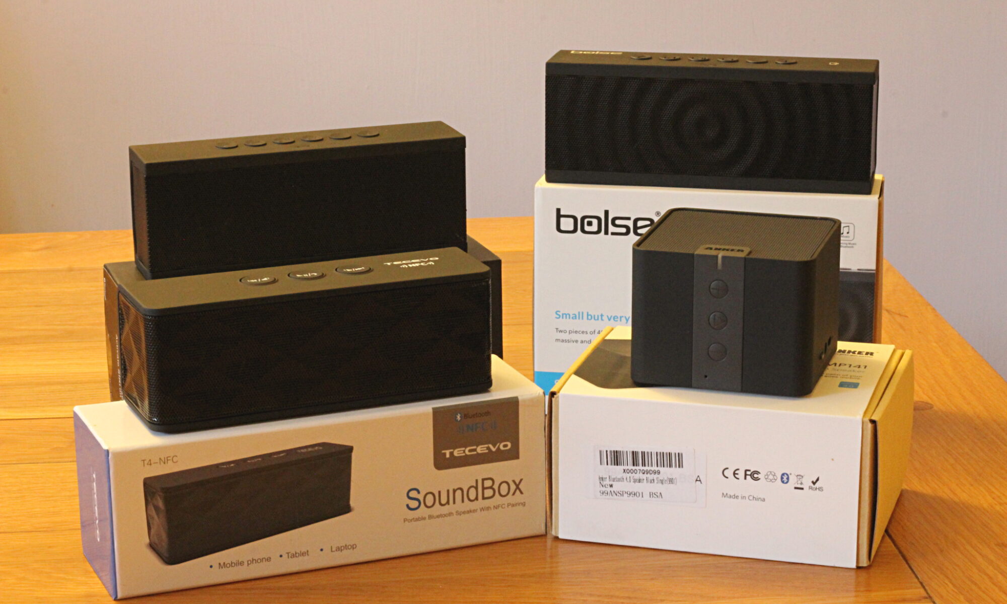
Four Bluetooth speakersFor this review, we’ve picked four of the highest-rated speakers on the market for around £30 (at the time of review – these prices can be quite volatile). Starting clockwise from the top left of the picture, with prices at the time of our purchase, they are:

All four speakers have the following features in common:

  • Bluetooth (duh)
  • Microphone for hands-free voice calls
  • Aux-in socket, for playing music via cable
  • USB and audio cables included in the box

We’;; now look at the speakers in turn and see what each has to offer – or not – besides the basics.

Elf WS-701

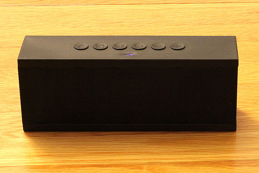
Elf01Let’s start with the speaker that was (just) the cheapest of the four: “The Elf”. The Elf is a pretty anonymous black box. All these speakers have a matt rubberized finish; in the case of the Elf and its brother (more on that shortly), the finish is a little on the cheap side.

It has a full complement of six buttons: track skip (forwards/backwards), volume up/down, play/pause and call answer. This suits me far better than the minimalist single button approach. I don’t want to memorize how many seconds I need to hold a button or how many presses correspond to each particular action.

Pairing with my Android phone was simple and easy. The speaker confirms connection in an excessively loud female American voice saying “Connected”. Not very subtle when you’re trying to set up some quiet tunes in the morning. And there’s something about it that’s a little… cheesy.

Though we didn’t test this exhaustively, the speaker seemed to live up to the claimed charge time of 3-4 hours and playback time of 10-12. It was in that ballpark. And it was about the loudest speaker in this group test – we could turn this one up the most, before distortion crept in. Bluetooth range was pretty reasonable – about 15 metres before the connection started to drop.

All the speakers can be used as hands-free speaker phones, and this one was the best of the bunch. Good, clear call quality, and it handled the problems of two-way audio (avoiding feedback) very competently. I’m not sure that’s why people buy speakers like this, but in a pinch, you can use this as a conference phone with little difficulty.

The Elf was the heaviest and the cheapest (at the time of purchase) speaker in this group and of the four, it’s the one I kept personally. It didn’t have the widest frequency response, but it is more than adequate – good, in fact for the use I now put it to daily: music in the shower.

Incidentally, if you’re looking for this speaker, just use the “WS-701” search term – it’s currently available under a different brand name, “Coppertech”.

This slideshow requires JavaScript.

Bolse SZ-801

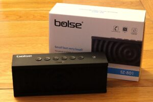
Bolse01It’s fair to say that Chinese technology companies aren’t renowned for respecting the intellectual property rights of other companies. I mean, “Bolse”. Come on guys. Next you’ll be calling yourselves “Microsloft”.

After the slightly comical name, the next thing you notice about this speaker is how similar it is to the Elf. Virtually identical in appearance, in fact. The model names are similar too – “WS-701” vs. “SZ-801”. In fact, the only major difference between this speaker and the slightly cheaper Elf, is that the Bolse has NFC, which we’ll come to in a second.

Here at Geek & Dummy, we don’t pretend to be technology insiders. We really are just a regular Geek and a regular Dummy. So we’re just going to conclude what everyone else knows is blatantly obvious: the two speakers came out of the same factory. The Bolse is a later or upgraded version of the Elf. Who knows if “Bolse” and “Elf” even exist as trading entities.

Given their similarity (the grille pattern is very slightly different), you’ll not be surprised to read that they fared almost identically in our tests. I found the NFC to be little more than a gimmick. Place your NFC-equipped Android phone (sorry, no iLove here, apparently!) and Bluetooth is automatically switched on and the phone and speaker automatically paired. Given that pairing and switching on Bluetooth aren’t exactly onerous tasks, I’m not sure I’d say this feature is worth the extra £5 you pay for it.

Again, in comparison to the Elf, playback time is down to 8-10 hours (from 10-12). The box claims it is a more powerful speaker (12W RMS vs. 10W) but in our tests, it distorted earlier than the Elf, indicating slightly poorer speaker construction. And hands-free call quality wasn’t bad, but slightly worse than the Elf, sounding “fuzzy” on the other end of the call.

The Bolse comes with a horrible drawstring bag, that you probably wouldn’t want to use for storage. The included audio cable is a little better than that included with the Elf.

In short, when placing the Elf WS-701 alongside the Bolse SZ-801, we’d only choose the Bolse if it were the same price as the Elf.

This slideshow requires JavaScript.

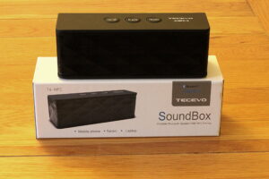
Tecevo T4 Soundbox

Tecevo01This is the lightest of the four speakers on test, weighing in at just 270g. It has just three buttons (forward. back and pause/play/answer). In our opinion, it’s the ugliest speaker on offer here today and it has the poorest battery of the set, at just 800mAh.

The Tecevo does have a few unique tricks up its sleeve though. First, it does come in other colours than black. Second, it has phenomenal Bluetooth range: 90 feet (27 metres) – by far the best range of any of these speakers. This far exceeds the typical range of Bluetooth devices.

And finally, which is perhaps most interesting, the Tecevo has an audio output socket (n addition to the input socket). This doesn’t mean you can daisy-chain speakers – the sound cuts out when you plug a lead into the output socket), but it does mean you can effectively use this speaker to Bluetooth-enable any other music system. Connect it to your ancient-but-good hifi, and stream tunes from your phone. Nice. Make sure it’s plugged into a USB charger though – the battery will give up the ghost before any of the competition.

Not that it matters much, but you wouldn’t want to use this speaker as a hands-free device. Calls sound like you’re in a tunnel, with lots of echo.

This slideshow requires JavaScript.

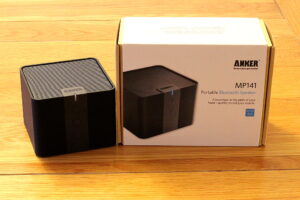
Anker MP141

Anker01This just leaves the Anker. Anker is making a good fist of emerging as a credible purveyor of gadgets, in a very crowded marketplace. We’ve seen a few items from Anker now, and they do stand out in the crowd: manuals that read like the writer does actually speak English, well-packaged, well-finished and with good warranties. The warranty on this speaker for example, is 18 months, which is not bad at all.

The Anker is a different form factor to the others. It’s square, rather than rectangular and houses a single large speaker, rather than the twin speakers in the others. It’s reassuringly chunky and the soft touch rubber finish has the highest quality feel of the speakers in this group.

The Anker has the longest claimed playback time, at 15-20 hours. We can well believe it, given it has the largest capacity battery (2100mAh) and takes the longest to charge (5 hours). The larger battery contributes to the general feeling of solidity. Without doubt it stands out for the quality of its construction.

It’s the most up to date speaker too, following version 4.0 of the Bluetooth specification. It suffers with range though, dropping out at just 10 metres (33 feet). It not the loudest either, and its bass response, though adequate, isn’t quite as good as the others. It’s also not great as a hands-free speaker.

This slideshow requires JavaScript.

Conclusion

So, which would we choose? If quality and aesthetics are most important to you, the Anker is the superior choice. But for us, the Elf is the clear winner, with its all-round abilities. And for a speaker this size, the sound quality is more than adequate. For sure, it’s no Bose, but then it’s a fraction of the price. And you wouldn’t want to take your expensive Bose into the bathroom with you – whereas with this, no problem. And helpfully, at the time we purchased, it was the cheapest of them all. Job done: buy the Elf (a.k.a. Coppertech).

Elf05

If you’re interested in all the data we captured and used for this review, here’s a spreadsheet you might enjoy. For the Geeks among us. 🙂

Review: TP-Link Powerline TL-WPA4220T kit

TP-Link TL-WPA4220T kitI’ve been using HomePlug AV adapters at home for years. These excellent devices turn your ring mains into a LAN, incredibly routing network data over your electrical cabling. As long as all your sockets are on the same phase, you can put a network socket wherever you have an electrical socket.

This is excellent news if you need to get Internet to some remote corner of your house, where your wifi doesn’t reach, but don’t want to trash the joint, installing network cabling. Plug one HomePlug device into a socket near your router and another wherever else you need it. That’s pretty much job done. Some of these devices can transmit data at up to 500Mbps, which is pretty impressive.

After six years of constant use, my old ZyXEL PLA-401s started becoming less and less reliable. I had four of these – one by the downstairs router, one upstairs plumbed into a separate wireless access point, another in the garage, likewise and finally one in the loft for my servers (which I’ve since retired, in favour of an excellent all-singing, all-dancing Synology DS214Play). Over time, the ZyXELs along with the two WAPs have developed some idiosyncrasies, needing occasional restarts. They were running a little hot and that’s never a good thing. Well they’ve provided good service, so nothing lost.

Ideally, I wanted to retire all the existing HomePlug adapters, plus the two wireless access points – and to do that in a cost-effective manner. My search brought me to TP-Link’s triple pack, the memorably named “TL-WPA4220T Kit“. £80 gets you three Powerline adapters, two of which are also wireless access points, with twin ethernet ports. Turns out this exactly matched my requirements, since I no longer needed a device in my loft. One device to plug into my wireless broadband router, one to provide wireless upstairs (and connect to two adjoining cabled devices) and one for the garage to provide wireless access in our garden.

TP-Link is one of the more reputable electronics manufacturers to send us gadgets out of China. Still, I’ve had a few run-ins with Chinese electronics, especially relatively cheap devices like these Powerline adapters, so I wasn’t expecting things to be entirely straightforward.

My first impression was favourable. My old ZyXEL adapters look clunky and old-fashioned next to these sleek, shiny gizmos. Clearly over the last few years, like all technology, the adapters have shrunk; and the pressure of certain design-led technology manufacturers has persuaded others to give aesthetics at least a token consideration prior to launch. There are two larger white adapters in the box (separately available as TL-WPA4220s) and a smaller grey-faced TL-PA4010. The smaller adapter is not wifi-enabled – you connect this one to your wireless router and it “introduces” your Internet connection to all other adapters (via the mains).

I read the promises of the simple “plug & play” (oh how nineties!) setup with a degree of skepticism. The poorly translated manuals did not instill confidence (though I’ve seen far worse). That said, these are consumer devices and I’m a Geek, so you’d think it wouldn’t be insurmountable. 😀

First, the problems. I could not get WPS to work. The idea is that you press the WPS button on your router, then the “wifi clone” button on the Powerline WAPs, and the network settings are automatically copied. I tried this every which way. You’ll appreciate that I’m no Dummy when it comes to these things, but it just wasn’t happening. Possibly my DrayTek router speaks a slightly different dialect of WPS. The TP-Links couldn’t understand the accent.

Another problem came from the fact that I attempted to set up the TP-Link adapters while the old ZyXELs were still installed. I half-expected that this would cause trouble. I was right. Ah well. A couple of factory resets later and with the ZyXELs unplugged we were working much better.

One more problem – though the TP-Links came with a CD, my laptop doesn’t possess a CD drive. I proxied the files via another CD-equipped device, only to find that the software included on the disk didn’t really work well under Windows 8. Doh!

Never mind. If you find yourself in this situation, do what I did: head over to TP-Link’s download site and grab everything you need from there.

Happily, once I had the correct software, I was able (easily) to log onto the wireless-enabled TP-Links, and enter all the wifi settings (twice, one for each WAP). With this all done, with the three devices talking to each other and the two wireless-enabled devices offering the same authentication requirements as my router, everything is now working brilliantly.

A great bonus for me, is the huge signal you get from the WAPs. I’d already upgraded my DrayTek router with larger antennae, but the TP-Link WAPs just blew it away. Twice the signal strength and much better connectivity all round my house (and up my garden). The drawback is that someone can now wardrive my network from the next county, but hey, that’s small price to pay for speed, right?

[easyreview title=”Geek rating” icon=”geek” cat1title=”Ease of use” cat1detail=”Some problems with WPS, but not too difficult to rectify.” cat1rating=”4″ cat2title=”Features” cat2detail=”High speed, extra LAN ports, WAPs included in the kit, MAC filtering if you want it – all in all, pretty impressive feature set.” cat2rating=”4.5″ cat3title=”Value for money” cat3detail=”Basically no kit that I’ve seen beats this on value.” cat3rating=”5″ cat4title=”Build Quality” cat4detail=”Looks really well built. Solid plastics. Reasonably attractive as these things go and not too big.” cat4rating=”4.5″ summary=”For me, this kit was great value for money. I wouldn’t have bought it otherwise. I have no hesitation recommending it.”]

Action Camera Comparison – GoPro 3 vs. Ghost Drift HD vs. Garmin Virb HD

I am an amateur film maker and my chosen subject is Land Rovers driving Green lanes on UK expeditions. I guess you could say I have quite specific requirements from an action camera but crucially I think, my filming is about as severe a test as you can get. Rough terrain, extreme weather conditions, impacts and even the occasional underwater dunking.

These are the conditions under which I need my action camera to operate. If I’m honest I don’t care what the manufacturer says the camera can do. I don’t care about the popular myths or if it’s the market leader. I want to know how they actually perform in the real world. To do this I am going to compare them in a number of critical areas with the only starting factor being that they must all be in a similar price bracket. In this case this is in the region of £250.

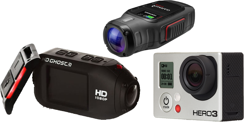
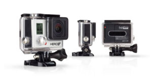
So the 3 cameras emerging as top dogs in that bracket are Garmins Virb HD, Drift’s Ghost HD and the market leading GoPro 3.

This slideshow requires JavaScript.

BASIC FEATURES

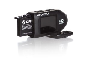
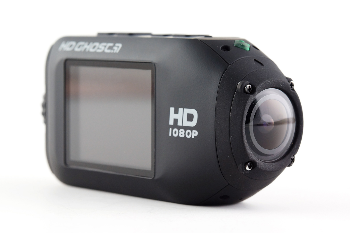
I’m finding increasingly that action cameras in this price bracket are packing themselves with features that you just don’t need. Let’s just concentrate on what’s important shall we? First up the quality of footage. On paper the Virb HD has the lens capable of shooting the best still and video footage. In reality, if you crank these cameras up to their highest settings you eat battery life and memory cards and your action footage, if fast moving, just looks weird. They all boast apps and phone connectivity, which is essential to the feature poor GoPro 3 as it doesn’t have an integral screen?!? Feature-wise it’s quite Ghost Drift HD remotetough to separate the Virb and the Drift Ghost HD. Both are very similar but I’d probably give it to the Ghost because of its fantastic multi-purpose remote control unit. The fact I can conveniently flick it on and off also means my editing time is dramatically reduced.


CONSTRUCTION

My big issue with action cameras has always been construction of the standard camera. Far too many claim to be impact-proof or waterproof but when you check, that’s only true if you put them in a case – usually a case that blocks sound, steams up and generally makes the camera harder to use.

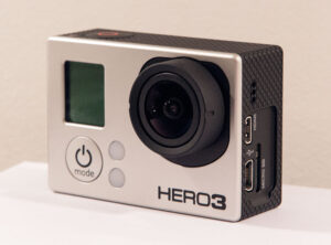
pdp_image_HERO3Plus_black_cluster1Comparing all three cameras, the GoPro 3 immediately stands out as the poor relation again because of its traditional and I’d say, old fashioned design. It’s square and bulky and to be honest feels fragile. In comparison the bullet style, rubberised finish of both the Ghost HD and the Virb scream ‘ACTION! Go and film something dangerous!’

PICTURE QUALITY

What’s the point in going to all this trouble to create an action camera if it doesn’t shoot quality footage? Obvious you would have thought, right?

All 3 cameras need some tweaking in the settings to get the best out of them. The GoPro 3 is the market leader and I find myself desperately trying to find something that sets it apart but again its picture quality proves to be a let down. If I’m honest all 3 are pretty damn good but if I were to grade them I’d say the Ghost Drift HD tops the chart, the Garmin Virb HD takes second place and the GoPro – well I can only assume it was designed for the brilliant sunshine of California because it doesn’t like dark British country lanes!

BATTERY LIFE

As I’ve mentioned previously, a simple fact of shooting HD footage is that it eats power; an action camera by definition is usually small and takes a small battery. You kind of have to accept this and move on. What becomes more interesting is the price and availability of spare batteries and how easy they are to swap out.

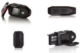
Tests indicate that, at what I consider the optimal filming rate for an action camera – 720 at 60fps, you get in the region of 3 hours of film time from all these cameras. In reality what I find is that because the Ghost HD is remote controlled, I’m more inclined to switch it on and off and subsequently I get a good 2 hours+ extra battery life. A quick scan of replacement battery costs and the GoPro 3 has the cheapest batteries at £6.77 (Yeah GoPro 3!) with the Ghost Drift HD replacement battery costing £6.89. The Virb is a relatively new product and the Virb HD replacement batteries are an eye watering £25 so you aren’t likely to pack 3 or 4 of them in your spare kit.Ghost Drift Open

All are a nightmare to swap the battery. If you have an image of balancing precariously on a ledge in driving rain while you flick open a compartment and slot in a fresh battery, think again because they are all fiddly to get to.

ACCESSORIES

What I find consistently in the area of accessories is that almost without exception they are shocking. I won’t claim to have tested or researched every one that is available but the ones I have used or seen for all 3 cameras just doesn’t have the quality feel I want, when I’m attaching a couple of hundred quid to it and bouncing it through forests and rivers. This is a slight digression but I won’t use anything but these VacMounts for action cameras, which are bullet proof and beyond compare!

GHOST DRIFT – 4.5 out of 5

drift-hd-ghost-hero[easyreview title=”Dummy rating” icon=”dummy” cat1title=”Ease of use” cat1detail=”To get the best results, you need to spend 10 minutes with the manual. Menu isn’t the most intuitive.” cat1rating=”4″ cat2title=”Features” cat2detail=”It has everything you need but that remote is simply brilliant.” cat2rating=”5″ cat3title=”Value for money” cat3detail=”It is the most expensive of the 3 tested.” cat3rating=”4″ cat4title=”Build quality” cat4detail=”Tough rubberised coating and waterproof seals. Solid.” cat4rating=”4.5″ summary=”This is where the smart money is. A genuine GoPro killer”]

GOPRO 3 – 3 out of 5

GoProHero3[easyreview title=”Dummy rating” icon=”dummy” cat1title=”Ease of use” cat1detail=”Having to extract it from the case to access the features is annoying.” cat1rating=”3″ cat2title=”Features” cat2detail=”It’s got everything the others have, except a screen…” cat2rating=”3″ cat3title=”Value for money” cat3detail=”Newer models have meant dropping prices and bargains can be found.” cat3rating=”4″ cat4title=”Build quality” cat4detail=”I just don’t trust its build quality. Without its case I’d say it was fragile at best.” cat4rating=”3″ summary=”I genuinely have no idea how the GoPro is the market leader. It’s adequate but no more.”]

GARMIN VIRB – 4 out of 5

garmin-virb-hd-action-camera-27[easyreview title=”Dummy rating” icon=”dummy” cat1title=”Ease of use” cat1detail=”Nice clear menu structure. Buttons easily accessible.” cat1rating=”4″ cat2title=”Features” cat2detail=”Has all it needs to have. If only it had a remote.” cat2rating=”4″ cat3title=”Value for money” cat3detail=”It’s fresh on the market at a low price. Great as long as you don’t want a spare battery.” cat3rating=”4″ cat4title=”Build quality” cat4detail=”Identical to the Ghost HD” cat4rating=”5″ summary=”A very close second to the Drift Ghost just pipped due to the lack of a remote control.”]

5 Minute Review: Dash Board Non Slip Vehicle Mat Mount for Car Sat Nav Tomtom GPS

I love these cheap little odds and ends that transform how you use a piece of tech.

The problem? I’ve never been very happy with the way my car’s satnav mounts. Inevitably it ends up on my windscreen leaving a tell-tale circle on the window for thieves to see and generally making the screen dirty.

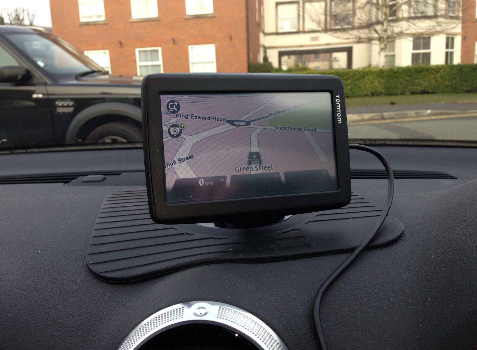
GPS Vehicle mount matEnter the very simple and very cheap non-stick car mount mat. I’m sure you’ve seen them advertised and I have looked at them and scoffed about how unsuitable they must be, especially given the textured dashes in most vehicles or the configuration of air vents resulting in a lack of flat surfaces. With the recent purchase of a TomTom Start 25M, I tagged on one of these fairly generic mats. (I did find a Car Sat Nav TomTom GPS version of the mat – perhaps there are some specific properties unique to TomTom?)

Very simply, the mat is completely fit for purpose. Even with my textured Audi dash and central vents, which the corner of the mat has to wrap around, it remains firmly on the dash. I say “firmly” – the centre piece that the GPS unit mounts on seems to lift from the dash surface slightly. As a result you can detect slight vibration in the attached device. That said, with some very tight and fast cornering and even an emergency stop, the mat and sat nav stayed resolutely in place.

Geek and Dummy TomTom GPS car dash mountMy TomTom Start 25M weighs in at 216 grams. If I’m honest I think that’s about the maximum weight I’d want to mount on the mat but that’s enough for most modern sat nav devices. I am very happy with the upright mounting of the sat nav and the fact I no longer have a sign on my windscreen announcing ‘there is a sat nav in this car somewhere; break in and steal me’.

I highly recommend you give one of these a try. Cheap as chips and simply brilliant!

Review: Ghost Drift HD Action Camera – The Best Action Camera for Vehicles & 4×4’s

SEE THIS CAMERA COMPARED TO TWO OF IT’S NEAREST RIVALS – VIRB HD & GO-PRO 3 

When I was first handed the Ghost Drift HD back in November it would be fair to say it had a lot to live up to – and not in comparison to the action cameras you might expect. The market leading Go-Pro I have always found to be all show and in fact not very much GO. My cheap and cheerful Kodak ZX range cameras are the real challengers, with their almost unparalleled lens quality, integral waterproof housing and cheap, easily changeable batteries. The Kodak ZX is a real hidden gem. So when I picked up the very sexy looking Drift HD with sky-high expectationsh, I was a bit disappointed with the results.

If you read my original review you will no doubt detect the ‘luke warm’ reception I gave it. Just keep in mind that I really did review it like the proverbial Dummy. I unpacked it, stuck in a memory card, mounted it on my bonnet and took it out.Ghost Drift Kit

Well what a difference a few months makes!!

Just before revisiting the Drift HD, let me qualify my review by saying I dislike the GoPro Hero 3 (direct competitor to the Drift HD). To start with, the internet is littered with stories of faulty units. My main beef though is that, since the manufacturer knows it’s considered to be the market leader, it cashes in on the hype with silly prices and expensive optional extras. Anyway, as far as I’m concerned if you need a separate waterproof case to make your action camera fit for purpose it’s just not an action camera!

Back to the Drift Ghost HD. The big selling point for me was the remote control unit and that’s proved to be a fantastic feature – not only because I can switch my cameras on and off from the comfort of the driver’s seat but because the colour coded LED indicators on the remote flash very clearly to tell me the cameras’ current modes. Don’t get me wrong, I keep it simple when I’m filming my green lane adventures but just occasionally I like to select the burst picture mode and take some still images – and the transition is effortless.

In my first review of this camera, I wasn’t a huge fan. So what’s changed to make me such a convert?

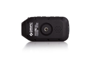
It’s amazing what a bit of experimentation can do. First off: mounting the camera. The 1/4″ standard camera thread is on the side of the camera. Brilliant I guess for a helmet cam. Not so much for a vehicle mounted camera. Nonetheless, get the right mounting solution and that little wrinkle is soon smoothed out.1/4 thread on Ghost Drift HD

Next, low light filming. The camera comes with default exposure setting of +0. Initially that gave me disappointing results. It only took tweaking that setting up to +1.0 and oh my word, the camera is transformed! I never thought I’d say this, but the images from this camera in all conditions are now superior to my beloved Kodak lensed ZX range of cameras. They are at least comparable to the very latest GoPro but without the silly price tag and it doesn’t need an extra case. Have I mentioned yet that the GoPro needs a waterproof case…?

It really is just the complete package for an action camera and as with all my kit this has been tested in wind, snow, constant driving rain and even the occasional dunking during a river crossing. I’ve also gained a few handy hints from this experience of using the camera in the field. These should really help you get the best from your Ghost Drift HD.

There is an app for the Drift Ghost HD. It’s quite a fun thing to play with and allows you to see what your camera sees, on your smart phone’s screen. Good fun to play with although I usually just use it to make sure my cameras are positioned correctly.

Spare batteries. Now although I found these batteries lasted approximately 5 hours of intermittent use via the remote control, I sometimes go on whole weekend trips; I wanted the flexibility of swapping out batteries. Spare batteries for the Ghost HD are very very cheap – about £11 for 2. Ghost Drift BatteryThat’s a lot cheaper than any of the other action camera contenders, for sure. The only thing I would say is that it’s a little bit fiddly to swap a battery. It gets easier with practice but not something you can do with cold gloved hands!

I run a Pure Sine inverter in my Land Rover so I can power larger devices. I’ve also picked up a great Patona external battery charger for these replacement batteries making the whole process of keeping my cameras running a lot easier and smoother.

Now as for memory cards, as you can imagine, shooting the amount of footage I do, I use about one 16GB card each day in each camera so it can be an expensive thing to kit myself out with enough of them. Well that’s where your friendly neighbourhood Geek comes in because he did a review of SD cards recently and it turns out that one of the cheapest SD cards is the best anyway, so the Samsung SD card is an easy and cost effective choice.

[easyreview title=”Dummy rating” icon=”dummy” cat1title=”Ease of use” cat1detail=”To get the best you need to spend 10 minutes with the manual.” cat1rating=”4″ cat2title=”Features” cat2detail=”What else could you possibly need.” cat2rating=”5″ cat3title=”Value for money” cat3detail=”It’s still a bit on the pricey side for me but a lot better value than the market leader.” cat3rating=”4″ cat4title=”Build quality” cat4detail=”Tough rubberised coating and waterproof seals. Solid” cat4rating=”5″ summary=”This is where the smart money is. A genuine GoPro killer”]

So you have my advice and you have my opinion now I’ve had the benefit of having used this camera in all conditions. It only remains fr me to show you the latest film I made with this set-up, which should be featured in Land Rover Monthly’s May Edition.

Review: Bose Soundlink Mini

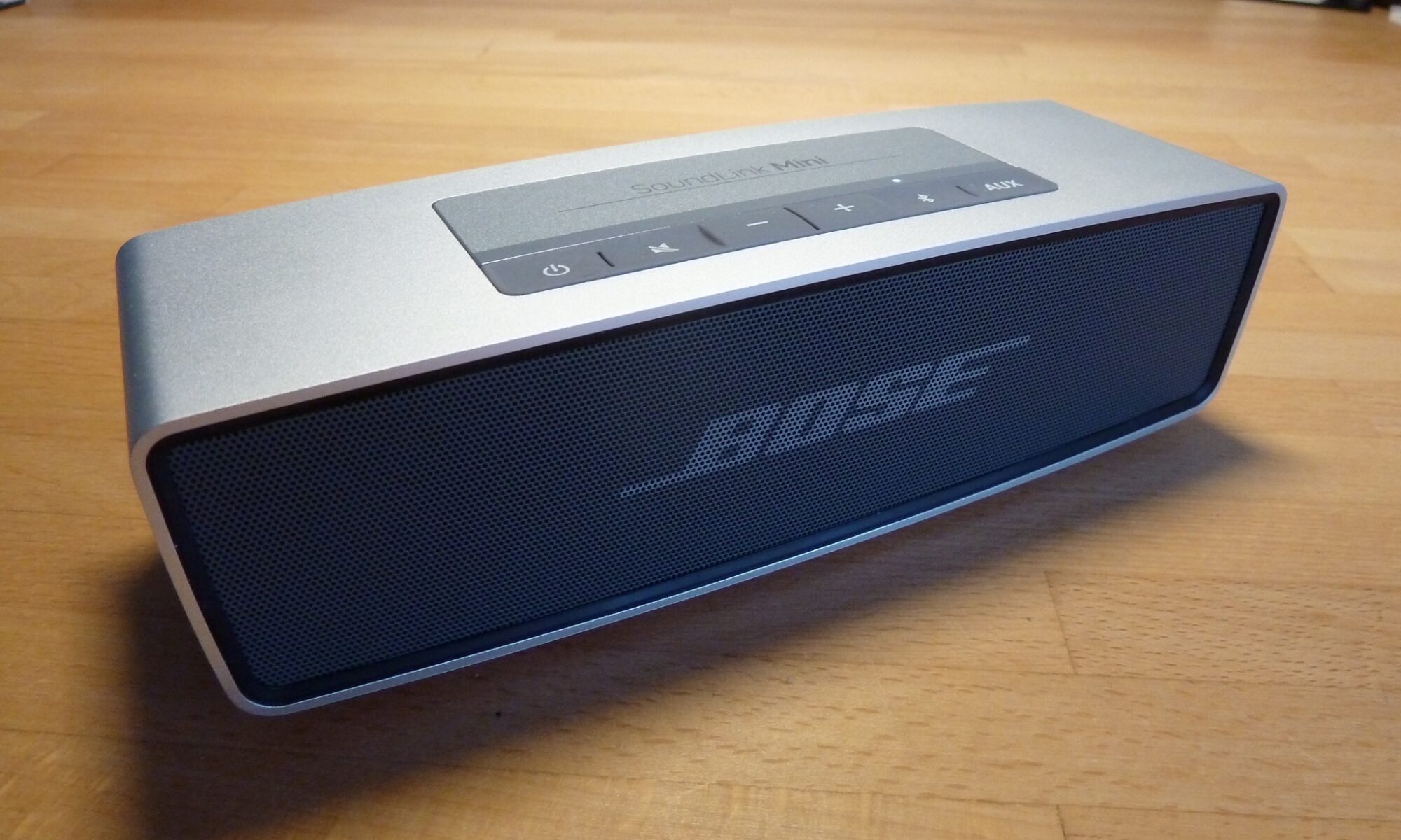
Bose SoundLink MiniSeldom does a product reach out and and grab me with the intensity of “Have me, have me”, like this product did. In fact I can honestly say that only the iPhone, (the original first release), gave me anything like a similar sensation. I recall like it was yesterday, in December 2007, just a few weeks after the iPhone was launched, when I first held it, and realised in only a few minutes that, no matter what – I had to own one, and fast!

Now, I’m aware of bluetooth speakers – I have been for some time. I’ve conducted some modest research into them in the past; my conclusion was always they were too damn (expensive), or just rubbish. Suitable for a camping trip perhaps, but certainly not for full time home entertainment.

Well, a colleague brought one of these into work recently. I kid you not, within seconds of it springing into life, the same iPhone sensation gripped me and I ordered one for myself the very same day.

Bose, I think most will agree is a quality manufacturer of speakers. They have been one of the market leaders for as long as I can remember, and I can remember the days when “technically advanced” was when your cassette player could skip to the next track! One of the better things ever to come out of America, since Coca Cola, Bose is right up there on my scale of best perceived quality manufacturers, on a par with European examples such as Audi, Omega and HP Sauce.

Bose SoundLink MiniSo when I first heard the Soundlink Mini in the flesh, not only was I blown away by the performance of such a compact unit, but I immediately also thought that it would fit the needs of my ever-demanding, cable-hating wife. The variety of places we could utilise this neat little device were numerous; we could take it outside in the summer, replacing the iPad Air that we use to play music when dining outside. Perhaps it could come with us on weekends away, to hotels, cottages, foreign holidays even? With a little thought, its use could be expanded with ease. Use it in the kitchen, broadcasting iPad Air audio from a YouTube cooking tutorial, listen to the football commentary whilst tinkering in the garage, piping Radio 5 Live from your iPhone 5s and so on. Take it into the bathroom, the workplace, your mate’s house – the options are almost endless.

Made largely from aluminium, the speaker is robust and weighs around 1.5 lbs, giving an immediate impression of good build quality. It has rubberised top-mounted controls and is a cinch to use. It can pair with multiple devices, (remembering the last 6). Connection of your device, phone, iPad, Mac, or PC is even easier than connecting to your car’s hands-free, without the need to enter any passcode.

From such a compact unit, my impression would be that it wouldn’t cope with any modest volume demands, but how wrong I was. Whilst I agree it may fall short of providing music enough to satisfy a full-on house party, it’ll certainly provide enough output to meet everyday needs in our house, and if I had neighbours, enough to get them banging on the wall I’m sure! One observation, of a slightly negative nature, is that you can’t adjust the tone the speaker offers the listener. I have a number of theories as to why this may be, but ultimately the lack of such a feature is not a problem as the output offered is rich and deep enough to do justice to rock music, and the treble range is just as sweet for raw acoustic performances – I simply love it.

An optional extra is a Bose carry case made especially for this unit, but at around £40 I don’t think it represents value for money. Bose also offer a variety of coloured soft shell cases, which you may find funky, but don’t really appeal to me.

If you want to read about the detail of the unit to learn about battery life and range, you can do so on Bose’s own website. I don’t get too hung up about stuff like that. I’m never far from a power socket, and I don’t live in a house with rooms anywhere big enough to test the range of the connectivity. Why would I want to control music upstairs when the unit is playing downstairs?!

If you’ve got £170 or thereabouts burning a hole in your pocket and need a wireless Bluetooth speaker which is well-built and offers top drawer performance, then stop reading this now, and get clicking! I’m married to a woman who views audio visual products / any technology really, about as high up her priority list as I do face cream and Yoga, so you may understand why we have clashed for years over these priorities. To be fair, cost isn’t the usual bone of contention – normally it’s whether it can be seen with the human eye or not. My wife doesn’t really care what it sounds like, how technically advanced it might be, where it came from or anything like that: if it’s visible, then “You think you’re putting THAT, there?!” is a standard response. Cables are sinews of the devil!

For those of you living with such a woman, who lives the minimalist dream and likes her choones, imagine the points you’ll score when you bin the cumbersome, slightly dated, yet perfectly functional and technically superior hi-fi unit and replace it with this?! If the £170 ticket price is making your eyes water too much though, take a look at Geek’s review of the Soundlink SW100.

This slideshow requires JavaScript.

[easyreview title=”Boris rating” icon=”collab” cat1title=”Ease of use” cat1detail=”So easy, even Dummy could use it. Effortless syncing with multiple devices.” cat1rating=”5″ cat2title=”Features” cat2detail=”Pretty basic really, but it does what it does, very well. I didn’t harbour any unrealistic expectations of it.” cat2rating=”3″ cat3title=”Value for money” cat3detail=”With a high ticket price, it’s only expensive if it fails to perform, and it certainly doesn’t.” cat3rating=”4″ cat4title=”Build Quality” cat4detail=”Premium build & premium performance, it’s a 5 from me.” cat4rating=”5″ summary=”With such simplistic function and premium performance and build, this is a top notch device. Well done Bose. “]

Review: Giotto’s Rocket-air Super Blower AA 1900

Dusty computerAnyone who’s pulled a computer apart will know how much dust, crud and miniature wildlife can take up residence within your machine’s delicate circuitry. This build-up is bad for your computer. In particular, it makes fans and heat sinks less efficient and causes everything to warm up.

At best, this is a nuisance. Many power-regulating computers will simply slow down to allow the system to cool off. At worst, though, the excess heat in a power supply for example can set your computer – and your house or office – on fire. Clearly this is not A Good Thing.

Periodically then, it’s a good idea to take an “air duster” to your computer’s innards. Air dusters usually consist of cans of compressed air, with a straw-like nozzle to direct the air flow. They’re designed to create enough pressure to remove dirt but not so much as to cause damage.

Where I work, we used to get through a ton of these cans of air. The problem was, just when you really needed the air duster, you’d look on the shelf and there’d just be an empty can. Harrumph. How inconsiderate.

Giotto’s Rocket-air Super Blower AA 1900
So looking around for a better solution to the problem, I came across this fellow, the “Rocket-air Super Blower” by the Chinese/Taiwanese Company, Giotto’s Industrial Inc. (Beware of the annoying noisy Flash animation that plays whenever you visit the site.)

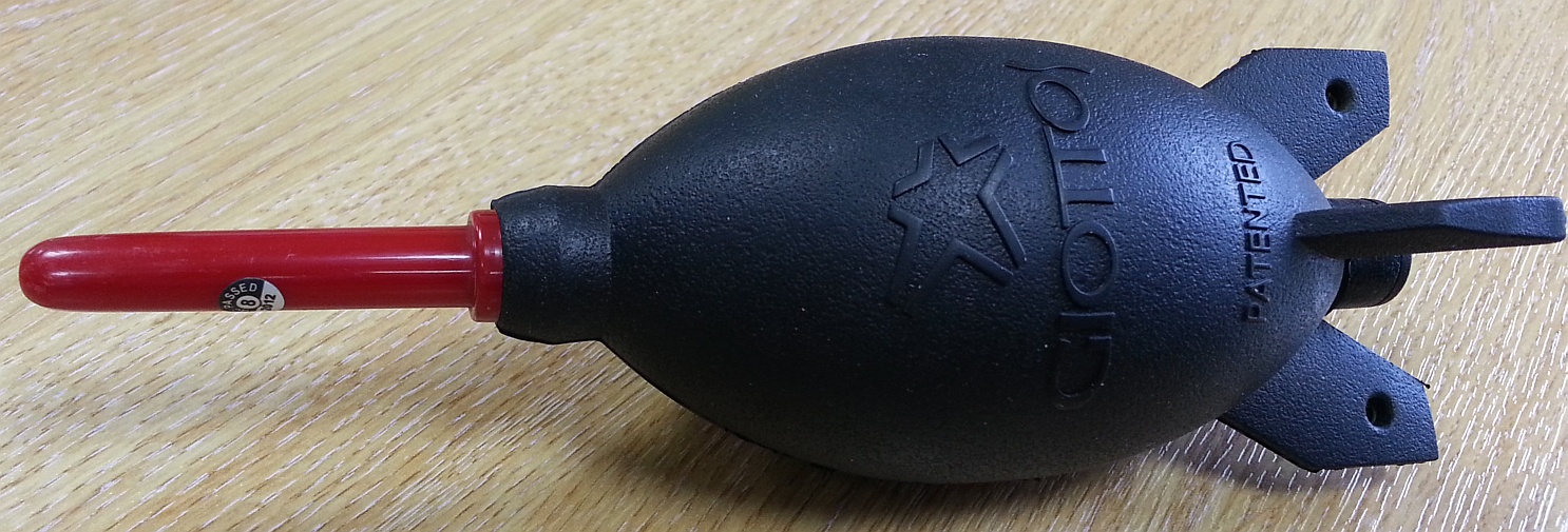
The Rocket-air has a thick flexible rubber body and a solid plastic nozzle. Squeeze firmly and you get a blast of air not dissimilar to that from a can of compressed air. It’s not hard work to operate and of course the best part is that you have an unlimited supply of air at your disposal (at least until some thieving, envious toe-rag runs off with it).

It’s theoretically available in a few different colours. I’ve only seen it in the UK in the red/black regalia, not that it matters: I didn’t buy it for its looks. Mind you, as looks go, it’s a fairly funky tool and was surprisingly quite a conversation piece when it first arrived.

Speaking of design, you have to love the attention to detail here. Giotto’s makes camera equipment, so the Rocket-air’s primary function is to blow dust from delicate camera lenses (the fact that we can bend it to other uses is a big bonus). On the opposite side to the nozzle, there’s a fast air inlet valve. This means that when you release the blower, rather than sucking dust back in through its nozzle, it pulls in (hopefully) clean air from the other side.

Oh, and the “rocket fins” on the base of the blower enable it to stand up stably. Not massively important, just a nice bit of design. On two of these fins there are holes punched so that you can thread a lanyard through. Great for hanging it from your neck should you be so inclined. People will give you funny looks though.

So it’s well made, durable, moderately attractive, great at its job – there’s got to be a catch, right? The price. Amazon has it on sale for £8.99 at the moment. I don’t know about you, but my first thought was, “That’s a bit expensive for a glorified executive stress toy.” But then if you think about it, you can’t really buy a can of compressed air for less than £3 or £4. So the Rocket-air pays for itself pretty quickly – I would expect it to last as long as a hundred cans of compressed air. When you put it that way, it’s a bit of a bargain.

This slideshow requires JavaScript.

[easyreview title=”Geek rating” icon=”geek” cat1title=”Ease of use” cat1detail=”Short of poking it in your own eye, I’m not sure you can get this wrong.” cat1rating=”5″ cat2title=”Features” cat2detail=”Does everything you expect of it. I suspect it could be made slightly more powerful, but otherwise, there’s little to criticise.” cat2rating=”4.5″ cat3title=”Value for money” cat3detail=”When you compare it with the alternatives, it’s pretty near the cheapest solution to our dusty problems.” cat3rating=”4.5″ cat4title=”Build Quality” cat4detail=”Great attention to detail. Some slightly annoying slivers of rubber haven’t quite been removed after it came out of its mould. But otherwise, really well made. Feels like it will last forever – or at least until I retire (which is much the same thing).” cat4rating=”4.5″ summary=”Great solution to the problem of safely cleaning dust and dirt out of computers and fans. As a bonus, you can use it on your camera too. Can’t really recommend it any more highly.”]

“Dusty Shuttle” image copyright © Dave Kirkham, licensed under Creative Commons. Used with permission.