There’s something better than a risk matrix? It’s a bold claim. But risk matrices have significant weaknesses, as I have discussed elsewhere.
In information security, we know (I hope) that our role is primarily concerned with the control of risk. We may agree that’s what we’re doing – but unless we can measure risk and show how our efforts change our risk exposure, where’s our credibility?
When suggesting we should measure risk in infosec, a common objection is that we can’t measure this – there are too many unknowns. But we do ourselves a disservice here: we know a lot. We’ve trained, we have experience. And much as I hate to use the term, we’re experts. (Certainly when compared to people outside our field.)
So we take our expert opinions, maybe some historical data and we feed it into a model. ‘Modelling’ can be an intimidating concept until we understand what we mean. We model all the time – tabletop DR exercises, threat modelling, run books, KPI projections. The point is once we know what we’re doing, it’s not intimidating at all.
So let’s get over that hump.
Risk modelling is a matter of statistics. Again, don’t let that put you off. You don’t need to be a stats whizz to use a statistical model. Many of us are engineers. We know how to use tools; we like using tools; we often make our own tools. Statistical models are simply tools; we just need to learn how to use them. We don’t necessarily need to be able to derive them. But usually we like to have some idea of what’s going on ‘under the hood’. So here’s a whistle-stop tour of the concepts underpinning the model I present below.
Distributions
Let’s say we’re finding out how many televisions there are in the households in our city. We take a poll, where each household reports how many televisions they have and then we plot a graph. The x-axis shows number of televisions, say from one to ten. The y-axis shows number of households with that number of televisions.
We might expect to see a graph a bit like this (yeah, that’s a lot of televisions):
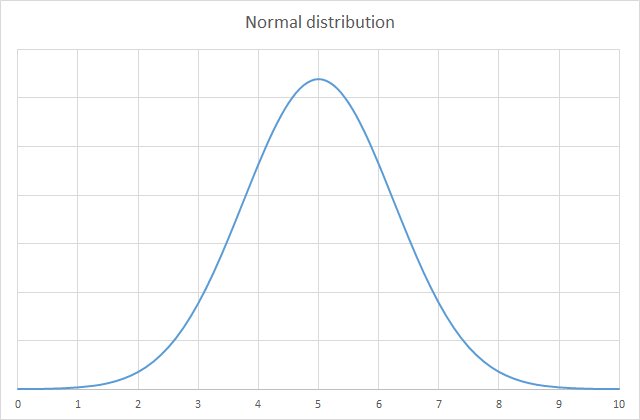
This is a normal distribution. Normal distributions are common in statistics and produce a curve that’s often called a ‘bell curve’, due to its shape. The data tends to congregate around a central point, with roughly equal values either side. The amount of spread is called the ‘standard deviation’.
Reality often shapes itself into a normal distribution. But in information security risk, you may find that other types of distribution better reflect the circumstances. One such option is the log-normal distribution. Here’s its curve:
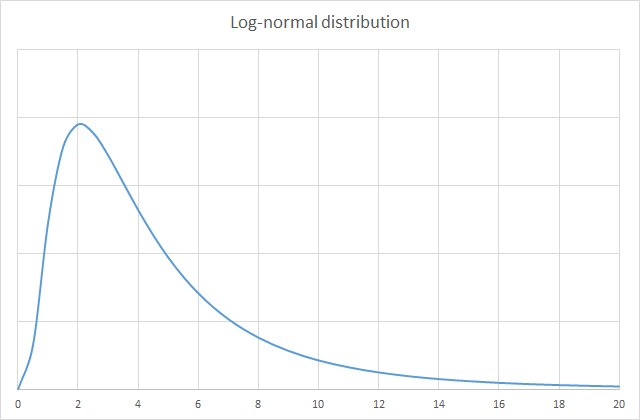
If we’re measuring the impact of an event, a log-normal distribution often fits the bill. It does not go below zero (an impact by definition means an above-zero loss). The values tend to congregate toward the left of the graph, but it leaves open the option for a low probability of a very high number, to the right of the graph.
What we’re doing is creating a mathematical/statistical model of reality. Since it’s a model, we choose whatever tool works best. A log-normal distribution is a good starting point.
Confidence interval
In measuring risk, we take account of our uncertainty. If we were in the enviable position of having absolute certainty about future events, we would be better off turning this astonishing talent to gambling. As it is, we’re not sure about the likelihood and impact of detrimental events, and hence we estimate.
When estimating impact, we could simply select a value from one to five and produce a risk matrix. But as we saw before, this is not particularly informative and in fact it can be misleading. One aspect that the ordinal scoring overlooks is that impact is best expressed as a range. If the negative event occurs, e.g. we experience a ransomware outbreak, that may prove to be a low-impact incident, or things may go horribly wrong and it costs us millions.
The confidence interval allows us to express a range for the impact, based on our level of uncertainty.
A confidence interval of 90% is often used. This means that the actual impact has a 5% chance of being above this range and a 5% chance of being below the range. In practice this proves to be good enough for our purposes.
Side-note: the log-normal curve that models a 90% confidence interval has a standard deviation of 3.29. We’ll use this fact shortly.
Imagine you have ten identical slips of paper. On nine of them, you write ‘winner’; on the other one, you write ‘loser’. All ten slips are placed into a hat and you draw one out at random. If you draw the ‘winner’ slip, you win £1,000. Otherwise, you win nothing.
On the other hand, there is a football match coming up today and your favourite team is playing. You are asked to predict the likely number of goals your team will score, within a range, with 90% confidence (nine in ten). Again, if you are right, you win £1,000.
In the book How to Measure Anything in Cybersecurity Risk, the authors call this an ‘equivalent bet’ test. If you prefer the idea of drawing slips out of a hat, because you think you’re more likely to win, that means you didn’t really use a 90% confidence interval for the football score prediction. You need to widen the range.
On the other hand, if you prefer the football bet, that means that your range prediction was probably too wide. You’ve used perhaps a 95% confidence interval.
The trick is to balance the two such that the potential reward is equivalent in either scenario. In this way, you will have achieved a true 90% C.I. with your football prediction. It takes a little effort to wrap your head around this but press on: this is an invaluable concept in risk analysis, which we’ll use shortly.
Estimating likelihood
When you’ve defined your threat event, estimating its likelihood is straightforward: define a time period and a probability (percentage likelihood) of the event occurring. To be meaningful, don’t make the event too specific. So ‘a ransomware outbreak’ is probably a better event definition for most companies than ‘a solar flare causing communications anomalies that disrupt global networking such that intercontinental backups are delayed by three hours’.
Over a 12-month period, you may estimate that you have a 5% likelihood of experiencing a ransomware outbreak. This percentage need be no more than the considered opinion of one or more experts. You can improve the estimation through the use of data: historical ransomware attacks in your sector, global threat activity, etc. But the data is no more required for this model than it was for a traditional risk matrix.
At this stage, do not consider the severity of the attack, just the likelihood. This likelihood percentage stands in the place of the 1 to 5 numbering in the risk matrix; it is simply more helpful.
Estimating impact
For impact, you now estimate a range, using a 90% confidence interval. You can use the equivalent bet test if you like, to guide your estimate. Again, you can take into account any available data, including known costs of breaches as they are reported worldwide. You can also consider things like the possible duration of an outage, the costs associated to an outage, the costs of paying the ransom or the excess on a cyber risk insurance policy. So you might say, all things considered, you are 90% confident that the impact would be between £250k and £1.5m.
We’re going to use a log-normal distribution, as shown above. During modelling, due to the long tail on this graph, you may find that the model produces some extremely high values that are simply not realistic (£75m, say) – unrealistic for whatever reason, such as the fact perhaps this exceeds your company’s annual global sales. You can therefore introduce a cap to this impact; e.g. a 90% C.I. of £250k to £1.5m, capped at £10m.
Modelling the risk
You now have all the data you need, to model the risk. What does this mean? Merely that you will insert these numbers into a formula and find out what happens when you run the formula a thousand, ten thousand, a hundred thousand times.
And why will you see different answers each time you apply the formula? Because we introduce two random variables. The random variables are based on all the above. The first random variable represents whether the event occurred ‘this year’, based the likelihood probability. To express this as a formula in Excel, Google Sheets or >insert favourite spreadsheet editor here< you do:
= IF (RAND() > likelihood, 0, 1)
Here, likelihood is the percentage expressed as a decimal (0.05). And RAND() produces a decimal number less than 1. So if RAND() is greater than 5%, the event didn’t occur and the result is 0. If RAND() is less than 5%, it did occur, hence the result is 1. We will multiply this by the impact, which we calculate next.
For impact, we use an inverse log-normal function. We chose to use a log-normal distribution above, we know the impact is somewhere within that distribution and again we use RAND() to work out the precise impact (‘this time’) based on this knowledge. Remember that with a 90% CI, there’s a 5% chance the impact will be higher or lower than the range we specified. And remember further that 3.29 is the standard deviation for such a curve.
So we have the range and the confidence interval and we’re working back to a single figure. The formula is this:
= LOGNORMAL.INV(RAND(), mean, standard deviation)
Or, where high and low represent the upper and lower bounds:
= LOGNORMAL.INV(
  RAND(),
  ( LN( high ) + LN( low ) ) / 2,
  ( LN( high ) - LN( low ) ) / 3.29
)
Use LOGNORMAL.INV in Excel. In Google Sheets the function is LOGNORM.INV. With log-normal distributions, the figures are based on the log of the mean and standard deviation – that’s why you see here the log function LN.
To prove that you don’t need fancy software or a powerful computer to do this modelling, I ran this simulation using Google Sheets on a modestly-specced Chromebook, over 1,000 rounds. You can download the spreadsheet at the end of this article to see how this worked. To cut a long story short, on one run of this simulation I ended up with the figure £45,540.19, being the annual risk exposure for this threat. (With just 1,000 rounds, you can expect to see some variation each time you recalculate, but it’s enough to demonstrate the model.)
You’ll see in the spreadsheet some columns mysteriously labelled “Loss Exceedance Calculations”. At some point, I may write an article to address that!
For now, I hope this has whetted your appetite and given you enough to start improving upon your risk matrices. Happy modelling! And if you’re interested in learning a bit more about statistics in general (some measure of stats fluency is well worth it), I suggest taking a look at Statistics for Dummies. Don’t be put off by the title!