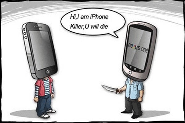
Geek has been telling me for a while now that the iPhone killer had really arrived and I must admit I have been looking longingly at the Samsung S4 Mini for a while. When I got the opportunity to try one out and review it, I jumped at the chance with a view to perhaps breaking my 5 year love affair with apple and iOS. Geek has the more powerful big brother Galaxy Note II
 but I don’t get that phone at all. I guess I’m just one of those people that think a phone should be pocket sized.
Now anyone who has been an Apple customer for many years will have become indoctrinated into the ‘Apple interface’. I kept in mind from the very beginning that there would be a learning curve and that I would have to keep an open mind to change. Not my best quality if I’m honest but on with the review!
Out of the box I was quite impressed. I recall when I got the iPhone 5 originally I was equally impressed with the quality and feel but I’d say the Samsung might have edged that just slightly. Generally size and ergonomics, there is very little between the two to be honest.
Everything on the iPhone is based around the home button and the the touch screen interface where the Samsung has a couple of nicely disguised additional buttons alongside the home button. When not active they are virtually invisible. If you swipe over them with your finger, an additional menu feature button lights up on the left and on the right a back button.
As you might expect with a version of a phone tagged as ‘Mini’ its not just its size that has been shrunk; the internal storage and the processor speed are both a reduced version of its big brother the S4. Just trawling around apps, emails and settings I couldn’t really find any discernible difference or lightning performance. Certainly not an iPhone killer so far anyway!
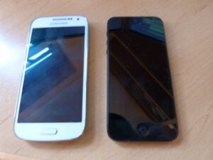
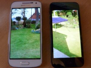
The screen initially appears nice. Good vivid colours but when I hold up the iPhone 5 to the S4 Mini
 , to my eye the iPhone 5
 wins on clarity and quality. Okay, the Samsung screen is a little larger, which is always good but not a major benefit in my eyes.
Enough about the look and feel for now and more about how it works, especially from the perspective of a brainwashed Apple fan!
To start with I found it a nice slick menu system. It felt bright and fresh. Perhaps not as intuitive as the iPhone but I put that down to my Apple ‘blinkers’ for now. I found the touch screen less precise than the iPhone. There was a lot of frustrating miss-typing going on and its not like I have sausage fingers or anything, honest!
I then started to go searching for all my mainstay apps that are essential to my mobile world. I was quite prepared that I might have to find an Android alternative if it was iOS specific. It’s here in this crucial arena that the credentials of this ‘iPhone slayer’ start to get shaky.
I’ve recently written a blog about the App store and the world’s fascination with it and apps in general. Its fair to say that apps are what set a phone apart from its competition and so far the Samsung and iPhone 5 were neck and neck. Tell me please what the App store interface is about on the S4 Mini
 ? It’s simply horrific. I can’t find the simplest and most mainstream of apps. It’s clunky and poorly organised. It does give you the option of going to the Google Play store which brings it all back down to planet earth but again the route to this is not intuitive at all. I was very disappointed with this aspect.
It’s worth nothing that Samsung loads its phones with supposedly “value added” apps that you can’t uninstall (without rooting). These apps usually are named “S “-something or “Samsung “-something. All in all pretty poor!
Lets finish by covering the basics.
Call Quality
The iPhone 5 has always had a big question over call quality. When it’s connected it’s quite good but all too often it drops a call for no apparent reason or goes straight to voicemail regardless of your signal strength. The S4 Mini
 has so far been faultless. It is very good at what its meant to be, a phone. The slightly scalloped edges seemed to make it more ergonomic to hold to my ear. – something the iPhone has lost between the 4S and the 5.
Camera
This is adequate but no more. It’s fine for quick snaps and it seems to let in plenty of light. Take a similar picture with the iPhone 5 and you can see that Apple has got this right and Samsung has missed the boat a little. I was only watching the Gadget show the other day which did a straw poll of people who bother to carry a camera or dedicated digital recorder these days. Because of the camera quality in smartphones the conclusion was that it was dying tech. Confusing then that the camera in the S4
 just doesn’t quite cut the mustard.
Battery
It’s always a tough thing to gauge battery life accurately or realistically because what I’ve installed now won’t compare to what I’ve installed next week. It’s difficult to tell how the battery will be drained by different demands. What I do know is that my iPhone 5 was rubbish from day 1 when it came to battery life. With moderate to heavy use of everything I need daily it will require a top up charge during the day and a full charge over night. So far the Mini is performing far better and after a day of setting up, downloading emails etc, it’s only just slid under 80%. Not bad at all.
So is this an iPhone killer?
I desperately wanted to like this phone. I can’t help feel like I should be willing to look beyond Apple; Android receives so many accolades Google must be doing something right. Geek thinks it’s our saviour from evil iOS. At its core the Mini is like an iPhone 4S . It does all it needs to quite well but at the end of the day it’s just an iPhone wannabe.
I have to say I sometimes wondered if my frustration at struggling through the menus (i.e. my own reluctance to try a new OS) was at the heart of my mixed feelings for this phone and maybe that’s true. What I do know is that iOS is intuitive enough to let me navigate around and find my way. With Android on the S4 Mini Mini, all too often I had to go and pester Geek to find out how to do something. Not really what I wanted from the new hub of my mobile universe.
I’m going to give it another week or two to see if I can get over my ‘Android phobia’ and maybe I’ll come back and review the S4 Mini again!
[easyreview title=”Dummy rating” icon=”dummy” cat1title=”Ease of use” cat1detail=”There’s just too many ways to customise and change .” cat1rating=”3″ cat2title=”Features” cat2detail=”It’s got everything a good smartphone should have but it lacks a quality camera and a seamless App store.” cat2rating=”2.5″ cat3title=”Value for money” cat3detail=”Design-wise I love it. It does everything it should and you can get it very cheaply on a good contract.” cat3rating=”4.5″ cat4title=”Build quality” cat4detail=”I’m a little torn. It’s a thing of beauty and I love its lightness but also worry that it’s frail because it’s so light.” cat4rating=”4″ summary=”It’s a good smartphone and I like it but it is no iPhone killer!!!!!”]
 almost daily and nibbling into Apples market share, it seems time for something dramatic from the innovative tech Company.
 may go all out with a 10 mega-pixel version with an f/1.8 aperture complete with interchangeable lenses.


